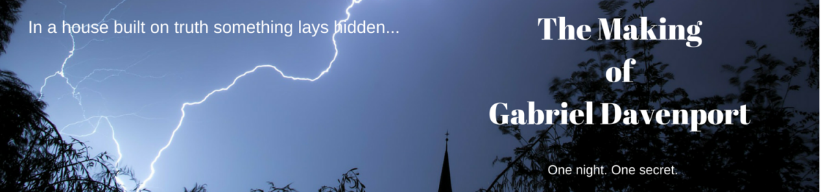
After a gestation period of 13 months, this week finally saw the unveiling of the long awaited cover to The Making of Gabriel Davenport!
I couldn’t be more pleased with the result, *hand drawn* by the very talented Maria Elena Maxwell. From the very beginning I wanted broken wings, to highlight Gabriel’s struggle. I wanted different shades of light to symbolise the fine line between darkness and light, and that blurred line inbetween where things hover in a lost place. And I wanted simplicity.
The font I am in love with! From the arched A and the gothic T to the whole feel of the letters – they whisper of the happenings on that one night, where one secret threatens to destroy everything Gabriel holds dear, including his fragile hold on reality.


I love, love, love the cover. Beverley, it’s so brilliant, minimalistic but with so much on, it swells with meaning. The font is absolutely amazing. 😀
LikeLiked by 1 person
Thanks so much, Aura! I’ve had an amazing response to it, I’m thrilled 😀 Now that it’s up on Goodreads as a tbr, it’s all feeling *very* real!
LikeLiked by 1 person
Aha, added it to my to-read list. Awesome. 😀
LikeLiked by 1 person
You. Are a pure treasure 💜 thank you so much! x
LikeLiked by 1 person
This is phenomenal. I cannot wait to read this. “One night. One secret.” Sold! Great work, Beverly. You have a fan here in Virginia-U.S.A.
LikeLiked by 1 person
Thank you so much, Nina! I couldn’t have got where I am now without the support from wonderful writers like you 🙂 so looking forward to sharing with you!
LikeLike
Everything about this much-anticipated book – words, artwork, design, website – is clearly done with heart as well as style. A magnetic combination. Well done, Bev, on being true to yourself, and to Gabriel.
LikeLiked by 1 person
Thank you so much, Jenny! Your words are always so supportive And you get where I’m coming from – all of it 💜
LikeLiked by 1 person
Just beautiful Beverley. Is there a teeny tiny spot of blood too? I cannot wait to read The Making Of Gabriel Davenport.
LikeLiked by 1 person
There is, indeed, a tiny spot of blood 😀 Thanks so much for being part of my little book dream, Nadia!
LikeLiked by 1 person
Ditto to you Bev x
LikeLiked by 1 person
The cover is simply splendid! The drawing, the colours, the font, the words. This is a cover I get drawn to. Very professional. The cover of a best-seller. 😀
LikeLiked by 1 person
Thank you, dear Agnete 💜 for your words, your support and your belief in my dream!
LikeLiked by 1 person
What a stunning cover! Such a beautiful font. I enjoyed reading through several of your blog posts tonight! 🙂
LikeLiked by 1 person
Thanks so much, Nicole 🙂 I really appreciate you stopping by and reading!
LikeLike
This cover is amazing. That little red spot has me wondering and making me love it more. I’m waiting for this book to be part of my personal library.
LikeLiked by 1 person
Thank you, dear Sarah 🙂 Your words and support are much appreciated, and I can’t wait to share (then you’ll see what the blood spot is all about!)
LikeLike